A motive in developing a color scheme
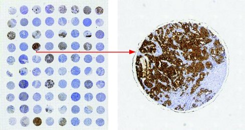
Tissue microarray is a set of slides containing “many small representative tissue samples from human/animal assembled on a single histology slide” 1. It is a high-throughput histology method 2 to effectively associate a protein expression to a disease.
To quantify protein expression, Immunohistochemstry(IHC) is one of the common methods to label the protein. A IHC-stained TMA usually have tissue spots stained in a gradient of brown 3; the intensity of brown color correlates with expression of labelled protein.

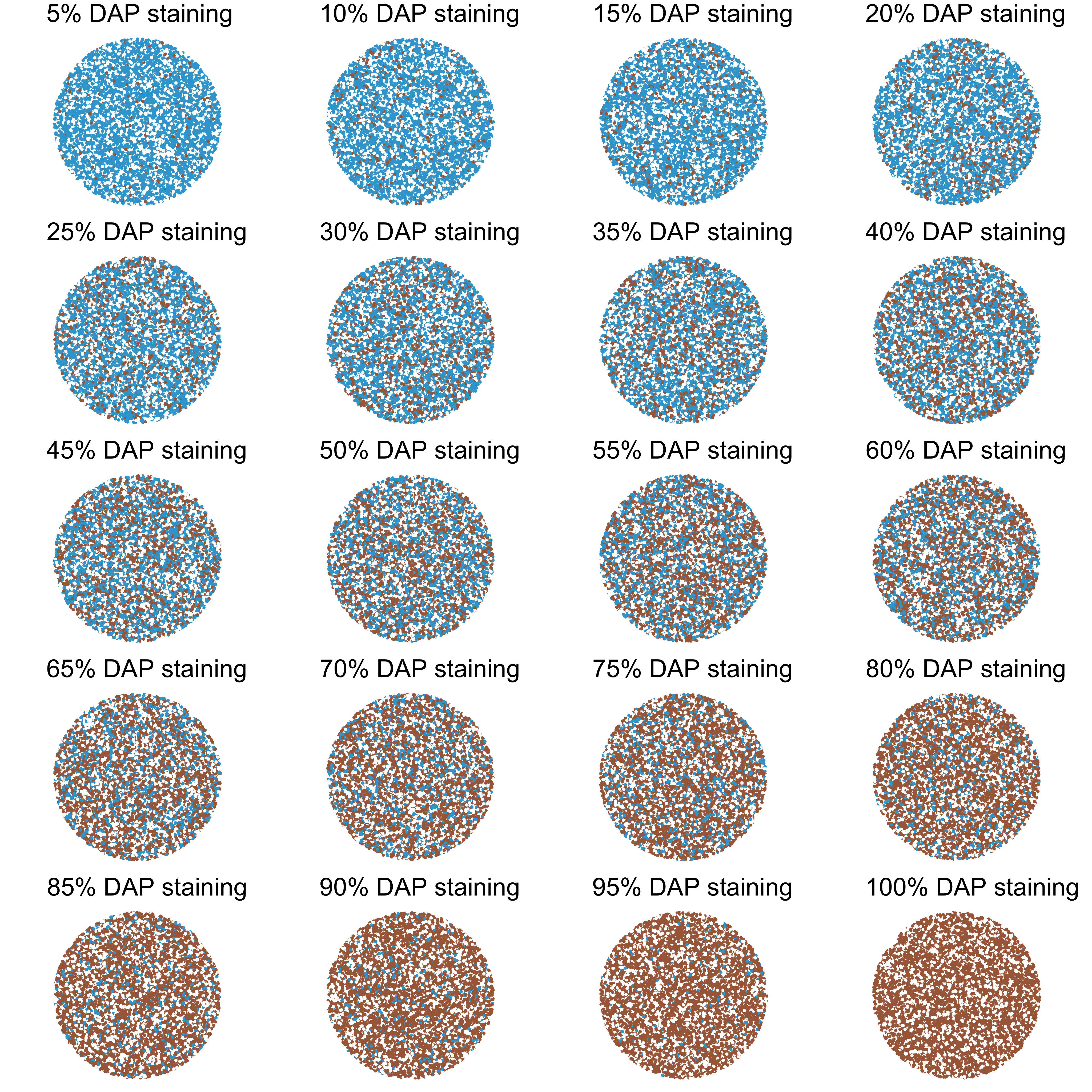
Although there are various algorithms and software that automate quantification, manual scoring is still commonly used. The first step of scoring involve identification the total percentage of brown area within the area/compartment of interest (e.g. cytoplasm of the tumor cell). Accurately translating a visual image to staining percentage requires practice and a series of reference images with 5% increment of brown area is produced to facilitate manual scoring.
Simulting a TMA slide with a gradient of brown staining.
Each stained spot is a round color patch containing brown, blue and empty space (white).
- to make it round, points within the circle is generated.
- to make choice the suitable colors, hex code from Digital Color Meter (a Mac program) is used with setting “Display in sRGB” on the previous image.
- background is given a constant 30%. The rest 70% stained area is further divided into respective brown as indicated.
library(tidyverse)
library(gridExtra)


perc_plot <- function(B = 10000, freq, nonstain_freq = .3, bg = "#FFFFFF", DAP = "#AA6845", hematoxylin = "#38A5D3"){
  t <- 2*pi*runif(n = B)
  u <- runif(n = B) + runif(n = B)

  r <- sapply(u, function(i) {
    if (i>1) {
      2-i
    } else {
      i
    }})

  ## use ~rep.int~ instread of ~rep~, since the danger of having argument time as an operation. see help("rep")
  samp_rdm <- sample(c(rep.int(0, B*nonstain_freq), rep.int(1, B*(1-nonstain_freq)*freq+1), rep.int(2, B*(1-nonstain_freq)*(1-freq)+1)), size = B)


tibble(a = r) %>%
    mutate(., x =  a*cos(t), y =  a*sin(t), stained = factor(samp_rdm)) %>%
    ggplot(aes(x = x, y = y, color = stained)) + geom_point()+coord_fixed()+
    scale_color_manual(values = c(bg, DAP, hematoxylin)) +
    labs(subtitle= paste0(freq*100, "% DAP staining"))+
    theme(axis.line=element_blank(),
          plot.subtitle = element_text(size=35),
          axis.text.x=element_blank(),
          axis.text.y=element_blank(),
          axis.ticks=element_blank(),
          axis.title.x=element_blank(),
          axis.title.y=element_blank(),
          legend.position="none",
          panel.background=element_blank(),
          panel.border=element_blank(),
          panel.grid.major=element_blank(),
          panel.grid.minor=element_blank(),
          plot.background=element_blank())
}

tp <- lapply(seq(from = 0.05, to = 1, by = 0.05), function(n) perc_plot(freq = n))

base::do.call(gridExtra::grid.arrange,tp)
A reflection
This series of reference images is of couse an over-simplification.
- it does not account the shade/intensity of brown color, instead only a single brown color was implemented.
- it only give a fix percentage of background.
- no cellular compartments are shown.
However, through this concise ggplot code chunk, we could get a touch on a complex research using visual simulation with aesthetic beauty.
Tissue Microarray: A rapidly evolving diagnostic and research tool.↩
in contrary to one tissue per slide.↩
The use of Diammonium phosphate (DAP) that is able to conjugate with the antibodies. The non-brownish area appear to be blue due to the use of Hematoxylin counter stain that targets to nuclei.↩