Barplot in biomedical science
Analysis of Variance (ANOVA) applies linear regression on a categorical explanatory variable (one-way ANOVA) or variables. It is widely used in biomedical research in the context of hypothesis testing. It potential answers a question that can be phrased in two different ways,
- whether the mean responses from one subgroup (e.g. treatment) significantly differs from the other (e.g. placebo). This statement emphasizes the fact that ANOVA compares the (standardized/normalized) group mean.
- how significant can we improve our ability to explain reality by giving a label/status (e.g. treatment or placebo). This statement emphasizes that ANOVA is a kind of linear regression which aims to minimize sum of the squares.
Post-hoc tests, as the names suggested, occur after ANOVA returning significance. In the event which a categorical explanatory variable has more that two levels, ANOVA only tells there is a difference in group mean but does not tell which subgroup differs from others. Post-hoc tests, consisting a class of pairwise comparison tests, addresses the follow-up question that was left by ANOVA.
Barplot is arguably preferable in biomedical journals 1 despite of the advice 23 and the disadvantage of using barplot 4. The purpose of this blog will
summarize the for and against of using barplot comparing to boxplot in visualizing a continuous response variable against a categorical explanatory variable or variables.give a prescriptive solution to visualize ANOVA and post-hoc test results in biomedical sciences.- go through a code snippet that automates barplot to visualize ANOVA and post-hoc tests.
The dataset
The data chosen 5 has the following characteristics
- a continuous response and two categorical explanatory variables
- replicate involved, albeit 4 replicates at each combination. More precisely, it is a technical replicate as a same individual was performed 4 measurement. Replicates enable statistical test, like ANOVA and post-hoc test, which its result is integrated into barplot as P-value, error bar and significant bar between groups.
The question that this dataset potential addresses is whether this individual’s monthly activity and sleep quality have significantly differed throughout the follow-up period OR they are not significantly differ and differences observed are purely due to technical variability.
To summarize the variables| type of variable | name and meaning of variable |
|---|---|
| continuous response | y = % performance (ranging from 0 to 100) |
| categorical explainatory | x = time (6 categories, every 4 months within two years |
| categorical explainatory | f = type of reading (3 exercises + 1 sleeping pattern) |
The dataset looks like the following after cleaning up.
perform <- read_csv("../../static/bar_plot/Scatter_plot.csv")
colnames(perform) <- c(colnames(perform)[1],
                     paste0(colnames(perform)[2], "_", 1:4),
                     paste0(colnames(perform)[6], "_", 1:4),
                     paste0(colnames(perform)[10], "_", 1:4),
                     paste0(colnames(perform)[14],"_", 1:4))

perform <- gather(perform, activity, `% performance`, -`Time (units)`) %>%
  separate(activity, c("activity", "replicate"), "_") %>%
  mutate_at(.vars = vars(`% performance`),
            .funs = funs(as.numeric(gsub("%", "", .)))) %>%
  mutate_at(.vars = vars(activity),
            .funs = funs(factor(.))) %>%
  mutate_at(.vars = vars(replicate),
            .funs = funs(as.numeric(.)))


head(perform) %>%
  kable(format = "html") %>%
kable_styling(bootstrap_options = c("striped", "hover", "condensed", "responsive"), font_size = 10)| Time (units) | activity | replicate | % performance |
|---|---|---|---|
| Jan–Apr 2015 | Flights of stairs climbed | 1 | 71.6 |
| May–Aug 2015 | Flights of stairs climbed | 1 | 100.0 |
| Sep–Dec 2015 | Flights of stairs climbed | 1 | 56.9 |
| Jan–Apr 2016 | Flights of stairs climbed | 1 | 75.9 |
| May–Aug 2016 | Flights of stairs climbed | 1 | 88.8 |
| Sep–Dec 2016 | Flights of stairs climbed | 1 | 47.9 |
repli_plot walkthrough
The function repli_plot is created. The names indicated that the input is table with each data point representing a replicate instead of the average of replicates. In total, the total data point will be
\[total\ data\ point = x \times f \times replicate = 6 \times 4 \times 4 = 96\]
| arguement names | meaning |
|---|---|
| df | the dataframe with every datapoint |
| xColname, xValue | the column name of explanatory variable and levels, which determins the order of levels |
| ctrl_index | the index of levels which is regarded as control to obtain effect size. default as first levels |
| yColname | the column name of response variable |
| f_pt | how to deal with another factor? FALSE = no the other factor; TRUE = have the other factor by create a seperate graph; dodge = using geom_bar(position = dodge) (developing, due to hard to automate significant bar.) |
| fColname, and fValue | the other factors |
| title_txt, y_lab, x_lab | labels |
| withDots | with each individual replicate should be shown as points? |
| errorbar | what is the error bar represent? least significant difference (LSD) bars will be inplemented. |
| showeffect | whether effect size should be shown, given ANOVA significance. |
| div | a common text divider |
| y_max | y_max should ~20% higher that maximun y to make space for significant bar |
repli_plot <- function(df,
                       xColname, xValue, ctrl_index = 1, # x grouping
                       yColname, # y/resposne
                       f_pt = c(FALSE, TRUE, "dodge"), # timepoint options
                       fColname, fValue, # the other factor value
                       title_txt, y_lab, x_lab, #labs
                       withDots = TRUE, errorbar = c("SEM", "SD", "95%CI"), showeffect = TRUE, # utils
                       div = 1, y_max = 120){

  ## assigning internal variable y, x and time.
  df$y <- df[[which(colnames(df) == yColname)]]
  df$x <- factor(df[[which(colnames(df) == xColname)]], levels = xValue)
  if(f_pt ==  "TRUE" || f_pt == "dodge") {
    df$f  <- factor(df[which(colnames(df) == fColname)], levels = fValue)
  }
  if (ctrl_index %in% seq_along(xValue) == FALSE){stop("ctrl index out of bound!")}

  ##anova test and tukey comparing significance
  ano <- summary(aov(y~x, data = df))[[1]][["Pr(>F)"]][1]
  post_hoc_pairs <- unlist(sapply(xValue[1:(length(xValue)-1)], function(first){
    lapply(xValue[(which(xValue == first)+1):length(xValue)], function(second){
      c(first,second)
    })
  }), recursive = FALSE)
  sign <- TukeyHSD(aov(y~x, df))$x[,4] # post-hoc tukey was used here.
  ## compares only the significant groups
  sign <- sign[which(sign < 0.05)]
  post_hoc_pairs <- post_hoc_pairs[which(sign < 0.05)]
  sign_ano <- ifelse(unname(sign)<0.0001,"****",
                     ifelse(unname(sign)<0.001, "***",
                            ifelse(unname(sign)<0.01, "**",
                                   ifelse(unname(sign)<0.05, "*", "ns"))))

  ## various label
  y_lab <- paste0(y_lab, "\n Error bar represents ", errorbar)

  if (f_pt == "FALSE" || f_pt == "dodge") {
    title <- title_txt
  } else if (f_pt == "TRUE") {
    title <- fValue
  }

  ## summarising by group
  df_sum <- group_by(df, x) %>%
    summarise(ybar = mean(y, na.rm = TRUE),
              se = sd(y, na.rm = TRUE)/sqrt(length((y))),
              sd = sd(y, na.rm = TRUE),
              n = n(),
              confint_l = ybar - qt(1 - (0.05 / 2), n-1)*se, # CI assumes a t-distribution.
              confint_h = ybar + qt(1 - (0.05 / 2), n-1)*se) %>%
    mutate(ctrl = rep.int(ybar[which(x == xValue[ctrl_index])], nrow(.)),
           effect = signif((ybar-ctrl)/ctrl*100, digits = 3)) %>%
    mutate_at(.vars = vars(effect),
              .funs = funs(ifelse(. == 0, "nc",ifelse(.<0,
                                                      paste0("\u2193", abs(.), "%"),
                                                      paste0("\u2191", abs(.), "%")))))


  ## plotting
  p <- ggplot(data = df_sum, aes(x = x, y = ybar)) +
    geom_col(fill = "#A0A0A0",  width = 0.4) + # using geom_col instead of geom_bar
    theme(axis.line = element_line(size=1, color = "black"),
          axis.ticks.x = element_blank(),
          aspect.ratio =1.6/(1+sqrt(5)),
          panel.background = element_blank()) +
    theme(plot.title = element_text(size = 23/div, hjust = 0.5),
          plot.subtitle = element_text(size= 20/div, hjust = 0, face="italic", color="grey60"),
          axis.title.y = element_text(size = 15/div),
          axis.title.x = element_text(size = 15/div),
          axis.text.y = element_text(size= 12/div, color = "black"),
          axis.text.x = element_text(size= 12/div, color = "black"),
          legend.text = element_text(size= 15/div, color = "black"))+
    scale_y_continuous(limits = c(0, y_max), expand = c(0,0))

  ## with dots
  if (withDots){
    p <- p + geom_point(data = df, aes(x = x, y = y), size = .5, shape=1)
  }

  ## type of error bar
  if (errorbar == "SEM"){
    p <- p + geom_errorbar(aes(ymin = ybar-se, ymax = ybar + se), width = 0.2)
  } else if (errorbar == "SD"){
    p <- p + geom_errorbar(aes(ymin = ybar-sd, ymax = ybar + sd), width = 0.2)
  } else if (errorbar == "95%CI"){
    p <- p + geom_errorbar(aes(ymin = confint_l, ymax = confint_h), width = 0.2)
  } else {stop("error bar can only represent sem, se, of 95%CI.")}

  ## show effect size
  if (showeffect && ano < 0.05){
    p <- p + geom_text(data = subset(df_sum, x != x[which(grepl(xValue[ctrl_index], xValue, fixed=TRUE))]), aes(x = x, y = ybar/2, label = effect), size = 4/div, fontface = "bold")
  }


  ## anova labelling
  if (ano < 0.001){
    ano_txt <- "P value from anova < 0.001"
  } else if (ano >= 0.001){
    ano_txt <- signif(ano, digits = 3) %>% paste0("P value from anova = ", .)
  }
  y_lab = yColname; x_lab = xColname
  p <- p + labs(title = title, subtitle = ano_txt, y = y_lab, x = x_lab )

  ## post hoc labelling
  if (ano < 0.05){
    y_pos <- seq(0.8, 0.93, length.out = length(post_hoc_pairs))*y_max # significant bars' y position
    p <- p + ggsignif::geom_signif(comparisons = post_hoc_pairs,
                                   y_position = y_pos,
                                   annotations = sign_ano,
                                   tip_length = rep.int(.02, length(post_hoc_pairs)*2), # double the length
                                   textsize = 8/div,
                                   vjust=0.8)
  }
  p
}
Single explanatory variable.
Only the time interval is considered to explain percentage of performance. There is no significant difference among all intervals
repli_plot(df = perform,
           xColname = "Time (units)",
           xValue = c("Jan–Apr 2015", "May–Aug 2015", "Sep–Dec 2015", "Jan–Apr 2016", "May–Aug 2016", "Sep–Dec 2016"),
           ctrl_index = 1,
           yColname = "% performance",
           f_pt = "FALSE",
           title_txt = "An individual's performance \n normalized by the respective maxima within the two years",
           y_lab = "a",
           x_lab = "b",
           withDots = TRUE,
           errorbar = "SD",
           showeffect = TRUE,
           div = 1,
           y_max = 120)
## `summarise()` ungrouping output (override with `.groups` argument)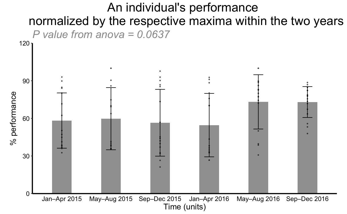
Percentage of performance against time interval with different activities.
The four activities are used in stratification. “Walking and running distance” and “Steps taken” are the two activities have significant increase throughout time.
split_activity <- lapply(c("Flights of stairs climbed", "Walking and running distance", "Steps taken", "Sleep quality"), function(n){
  filter(perform, activity == n) %>%
    repli_plot(.,
               xColname = "Time (units)",
               xValue = c("Jan–Apr 2015", "May–Aug 2015", "Sep–Dec 2015", "Jan–Apr 2016", "May–Aug 2016", "Sep–Dec 2016"),
               ctrl_index = 1,
               yColname = "% performance",
               f_pt = "TRUE",
               fColname = "activity",
               fValue = n,
               title_txt = "An individual's performance \n normalized by the respective maxima within the two years",
               y_lab = "a",
               x_lab = "b",
               withDots = TRUE,
               errorbar = "SD",
               showeffect = TRUE,
               div = 1,
               y_max = 120)
})
## `summarise()` ungrouping output (override with `.groups` argument)
## `summarise()` ungrouping output (override with `.groups` argument)
## `summarise()` ungrouping output (override with `.groups` argument)
## `summarise()` ungrouping output (override with `.groups` argument)do.call(grid.arrange, split_activity)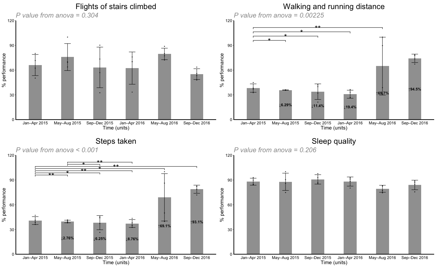
repli_plot design challenges and future improvements
Managing fontsize from graph
Graph embedment is crucial in achieving literate programming since it automatically adds graph produced by source block into specific location with appropriate dimension and resolution. The process of graph embedment in this blog, and generally in all literature programming IDE (like Rstudio and Emacs Org mode), can be generally decomposed into the following processes
- export the graph into
.pngformat with appropriate height/width, aspect ratio and resolution; - include a link pointing to the static graph in latex/html intermediate.
Although .pdf is independent of the scale, .png is used to insert picture into web. In the process of rendering png, texts in graphs become problematic; the problem occurs when we start to combine multiple graphs, 4 in previous example, into a single png. The mechanism that causes the problem is that R text size depends on the graph area 6 and is not scalable with other elements of the graph. As including 4 graphs arranging in a 2x2 matrix halves the width and height as compared to original, the invariable text size becomes inappropriate large and overlapping with each other 7.
There are a few solution that results this in multiple plot.
using a common scaling factor to reduce text size.
devimplemented here andcexargument ingraphics::par(seehelp(par)) are two examples. However, there might be problem.- scaling leads to non-integer font size. Is there coresponding (non-integer) size for that font?
- I failed to defind a theme variable
text_theme <- ggplot2::theme(with dev variable in), meaning the value ofdevcannot be changed if a text_theme is used. I leave this for future exploration.
using
knitrchunk options. In Rmarkdown, given a fixedfig.asp, we varyfig.widthanddpibut make sure the multiple remains the same.
\[ total\ pixel\ in\ width = fig.width (inch) \times dpi(pixel\ per\ inch)\]
Positioning significant level bars among “dodge” bars.
Up to the point when this blog is conceived, ggsignif 8 is still the only package that provide a ggplot layer to visualize significant level from pairwise comparison. To visualize two categorical variables, position = "dodge" should be used as the argument for geom_bar. However, “dodge” bars change the x positions thus we might need to adjustment.
The adjustment is closely related to bar width and the levels in dodged bar. Take an example from ggsignif CRAN vignette 9, although this will be a future development.
dat <- data.frame(Group = c("S1", "S1", "S2", "S2"),
                  Sub   = c("A", "B", "A", "B"),
                  Value = c(3,5,7,8))
y_max = 10
bar_width = 0.4/4
annotation_df <- data.frame(start = c(rep(1,5), 2)+c(-bar_width,-bar_width,-bar_width,bar_width,bar_width,-bar_width),
                            end = c(1, rep(2,5))+c(bar_width,-bar_width,bar_width,-bar_width,bar_width,bar_width),
                            y = seq(0.8, 0.93, length.out = 6)*y_max,
                            label = 1:6)
## intergroup comparison is +/- bar_width

ggplot(dat, aes(Group, Value)) +
  geom_bar(aes(fill = Sub), stat="identity", position="dodge", width=(bar_width*4)) +
  geom_signif(xmin=annotation_df$start,
              xmax=annotation_df$end,
              annotations=annotation_df$label,
              y_position=annotation_df$y,
              textsize = 3,
              vjust = -0.2) +
  scale_fill_manual(values = c("grey80", "grey20"))+
  scale_y_continuous(limits = c(0, y_max), expand = c(0,0))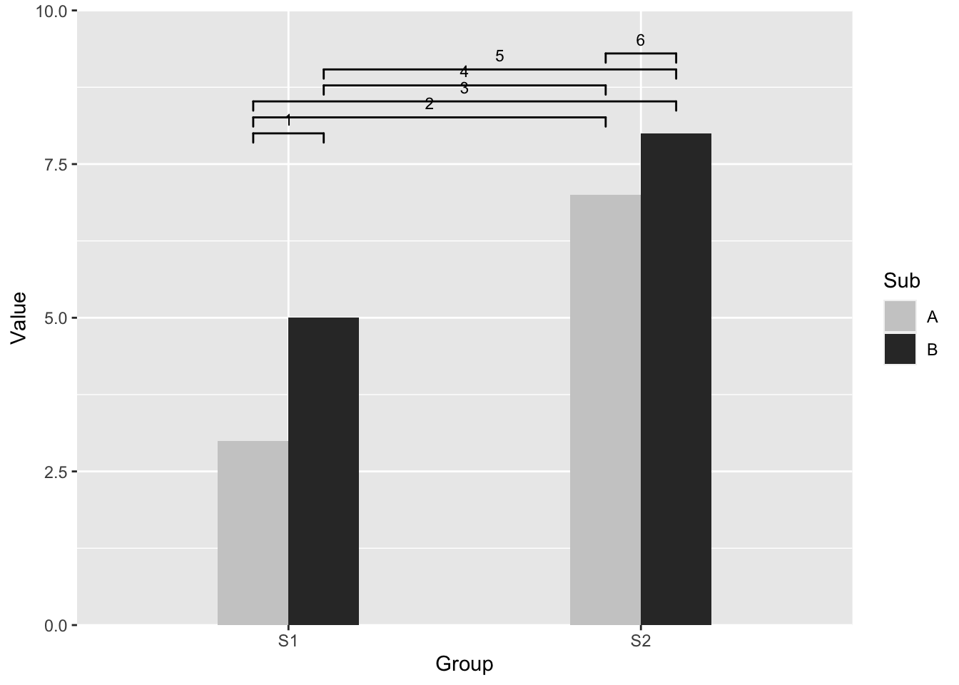
Page 512, Crawley, M. (2012), The R Book. Wiley, 2nd edition.↩
Plots to avoid from PH525x series - Biomedical Data Science↩
“Scatter plot.csv” from “Show the dots in plots”(the article in previous subtitle)↩
Section5, 10 tips for making your R graphics look their best↩
ggsignif introduction. Adding significant level bars among dodged bar plot↩